textstyle
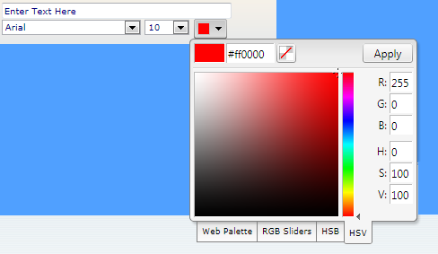
| Description | Displays one row text box with optional Font dropdown list, Size dropdown list, colour dropdown list or colour picker. Important: The block has to be a textflow type or embedded inside a textflow block. | ||||
 | |||||
| Reference | [font][size][color][settings][notextbox] or [font][size][colorpicker][settings][notextbox] | ||||
| Value Syntax | [font fontname1:default,fontname2,fontname3,...] [size size1,size2:default,size3,...] [color colorname1:pdflibcolor1:webcolor1:default,colorname2:pdflibcolor2:webcolor2], or [settings textboxwidth:fontdropdownlistwidth:sizedropdownlistwidth:colordropdownlistwidth:designmode(1 or 2)] [notextbox] to hide the textbox. Used for styling other blocks. For Defaults use: [font][size][color]or[colorpicker] without parameters. The styling dropdown lists and color picker are optional. To not add any styling option, simply enter none as the value. It is recommended not to use the command in this case. | ||||
| Separators | ^Record Separator :Value Separator | ||||
| Examples |
| ||||
| font parameters | A list of font names as used in the block file. All fonts, except for Host and Built-in, should be added to the fonts force load section. | ||||
| font Examples |
| ||||
| size parameters | A list of font sizes separated by commas. A default keyword can added to any size preceded by a colon to make that size the default. | ||||
| size Examples |
| ||||
| color parameters | A list of color information separated by commas. The first part is the color name. The second part is the color as define in PDFLib. The third part is a web color. The fourth part is optional and can appear one to specify a default. | ||||
| size Examples |
|
color parameters
color Examples
Use the default set of colours
black is the name that will appear to the user, {gray 1} is the PDFLib representation of the colour. #000000 or simply black is the web reference
Reference
colorpicker parameters
- Median - Metro - Module - None - Office Opulent - Oriel - Origin - Paper - ReallyWebSafe
- Solstice - Standard(default) - Technic - Trek - Urban - Verve - Web216
colorpicker Examples
Use the default set of colours
the last option is either icon to display an icon for the color picker or noicon to display the full colorpicker
Reference
settings parameters
textbox width (pixels):font dropdown list width (pixels):size dropdown list width (pixels):
color dropdown list width (pixels):designmode(1 or 2(default))
settings Examples
Use the defaults, can be omitted.
width of the textbox: 200 pixels
width of the font dropdown list: 100 pixels,
width of the size dropdown list: 50 pixels,
width of the color dropdown list: 50 pixels,
2 for displaying the control in two lines
Screen Shots

Color dropdown list and text box on the same line:

Was this article helpful?
That’s Great!
Thank you for your feedback
Sorry! We couldn't be helpful
Thank you for your feedback
Feedback sent
We appreciate your effort and will try to fix the article